Part One - Photobook
For this assignment I had to produce a
photo book with a minimum of eight pages, the theme of the book can
be of my choice either something new or extend a previous project I
had done, I decided to extend an assignment on dog walkers as I
really enjoyed it last time and built up confidence when approaching
the public. This time around I choice to use a 35mm film camera as I
wanted to explore with different types of photography and also
strengthen my knowledge and skills with the area of photography, not
only that but as I have already done an assignment on dog walkers I
was interested in this time around seeing the outcomes and comparing
them to the previous project because I had done it digitally.
To start of with I was unsure on what
type of book I was going to create so I took part in workshops that
demonstrated how to create and bind your on books for example,
perfect binding, concertina books, Japanese stab stitch and five hole
pamphlet stitch, by learning how to create these I was starting to
generate ideas on the type of book, size and layouts I wanted to
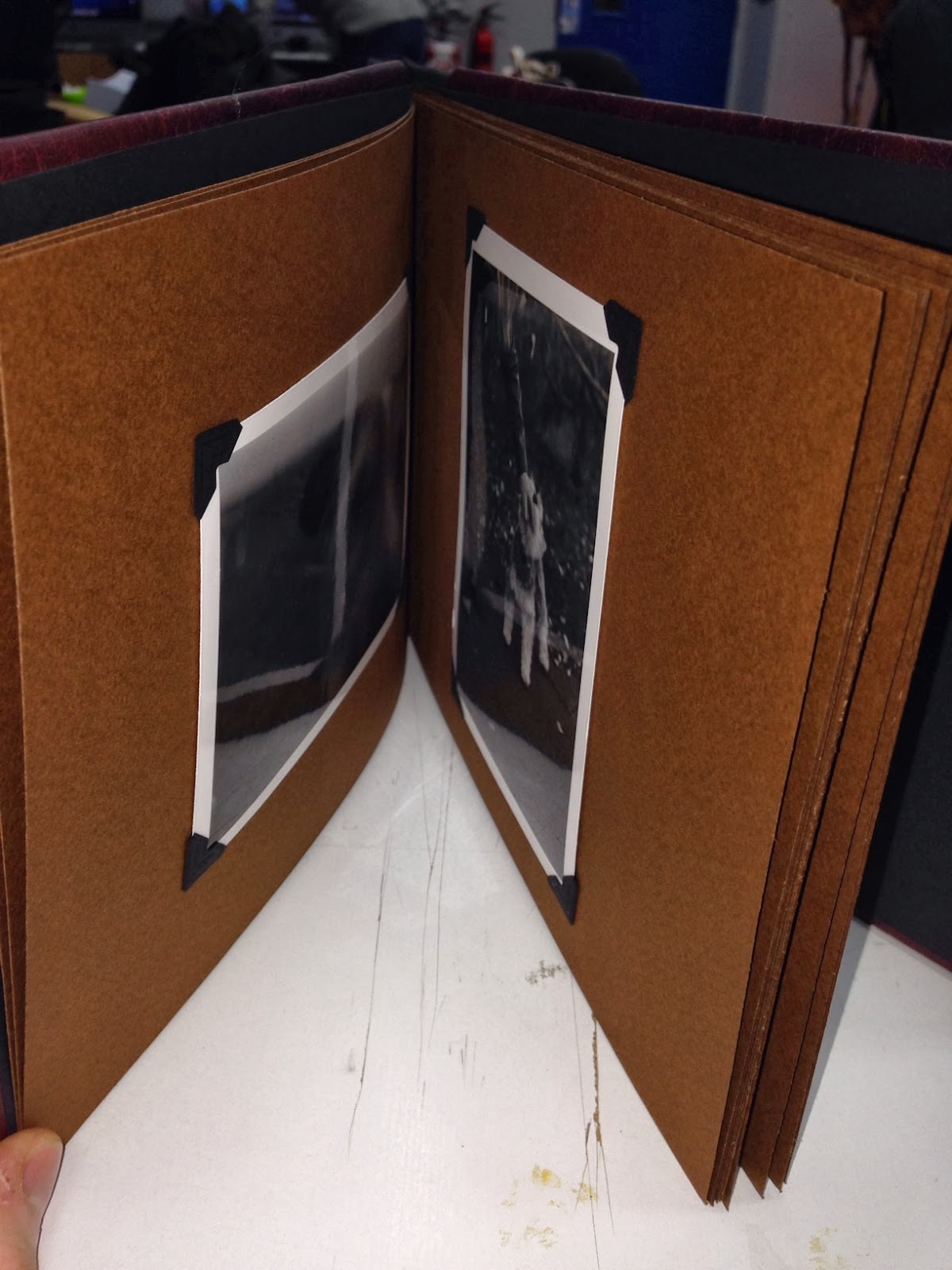
produce. However I came across an old family Photo-Album of my Nans
which instantly inspired me, I loved the style and layout of the
photos and the album became a big inspiration and drove me to me
passionate and precious when it came to producing my Photo-book. The
images where in black and white an it made me realise the potential I
could get out of using a 35mm film camera.


For inspiration I looked at Eliot
Erwitt as he is one of the main photographers who has photographed
dogs he was the main inspiration to the previous assignment I had
done of dogs. I quite like how his images have a slight comical
humour to them and they all have a different character in each photo.
I wanted my Photo-Album to have a family vibe to it so by researching
on Sue Packer a photographer who creates portraiture of a person and
their pet I was able to see different ways animals are photographed,
each photo looks like it belongs in a Photo-Album because of the
relationship the owner has with the animal. As before I was very
formal when it came to taking my photos of the dogs but this time
around I learnt to try and loosen up and produce happy accidents and
photos that are not all in focus or perfect as my Nans Photo-Album is
not perfect many images are either not in focus or the exposure is
wrong.
To understand the process of making my
Photo-Album I produced a mock up this is to see what my final will
look like and also whether I came across any problems that I could
change for the better, and I did come across a few errors, the first
was I forgot to put a spine in my book so what I would notice is if I
had multiple pages in it the covers would start to open and would not
sit flat this would be a big problem as I want it too look old but
still professional.
The final set of photos I have created
are all quite diverse I took on board not to be so formal when it
comes to taking my photos as I wanted them to be snappy and portray
some character within them.
One of the strongest photos from the
set is of a Shar-pei dog in the distance, what is striking about it
is the contrast, I firstly started by experimenting with the
different exposure times as I wanted the right tone I found that 2.5
seconds was just right, however I tried burning in the sky and around
the image to add mood and more contrast. The inspiration for burning onto my
prints was Giacomo Brunelli his images are very strong and bold
because he over kills his prints by burning them excessively but
they're intriguing and not off putting, what I really like about them
are how he uses depth of field drawing the viewer in more to the main
subject.

This print is another of my favourites
just because of the texture of the dogs hairs and also because of the
type of shot it is, the dog is up close investigating myself and the
camera creating a nosey character. The texture of the hair was not
there to start with it was very flat and greyish, I had to experiment
with adding contrast by boosting up the colour magenta I come to the
conclusion that 55% was a reasonable amount.
Resonantly I believe I could of added
just a bit more contrast to the image to bring out the texture but
again not all of my Nans photos in her album are great so it does not
bother me so much but I would of liked to experiment more with the
contrast if I had more time.

From the set I believe this is the
weakest print it lacks character and contrast compared to the other
images, I believe it is obvious but I still like the image and that
is why I will still include it in the final set. I again experiment
with the different exposure times until I was happy I had the right
tone, I found that 5.5 seconds was just right but it needed a lot of
contrast to make the print acceptable, 50% helped the print a lot but
now looking at it I could of tried adding more.
As I really enjoy using 35mm film
cameras and developing my own film I will defiantly be exploring
more with it in the future but what I have learnt is I need to give
myself more time to print my negatives as it can be very time
consuming with the trail and errors.
I have enjoyed and learnt a lot with
this Photo-Book assignment such as how to create and bind my own
books I will carry on making my own books as its a great skill to
have especially when it comes to exhibitions, also I believe I became
more independent when it came to the dark room I have defiantly built
up my skills and confidence and by making mistakes I have only learnt
from them.
There is just a few things I would
improve about my final photo-Album such as the corners of the book
covers, as I have not cut the leather perfect the covers now show the cardboard underneath, this is just a tiny mistake which now I
will learn from and when it comes to making more books I will know
how to stop this problem happening again.
Also I should of thought of a better
material to use for the spine of my photo album, although it looks
nice now but because of the material it is over time it will start to
get damaged when handled, so again I will experiment with materials
that I know will say strong and not get damaged over time, as this is
the first ever book I have made I am very pleased of the turn out and
have learnt a lot and will take the knowledge and skills and keep
progressing.